6.8 Adding Means to a Box Plot
6.8.1 Problem
You want to add markers for the mean to a box plot.
6.8.2 Solution
Use stat_summary(). The mean is often shown with a diamond, so we’ll use shape 23 with a white fill. We’ll also make the diamond slightly larger by setting size = 3 (Figure 6.21):
library(MASS) # Load MASS for the birthwt data set

ggplot(birthwt, aes(x = factor(race), y = bwt)) +
  geom_boxplot() +
  stat_summary(fun.y = "mean", geom = "point", shape = 23, size = 3, fill = "white")
#> Warning: `fun.y` is deprecated. Use `fun` instead.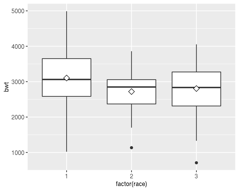
Figure 6.21: Mean markers on a box plot
6.8.3 Discussion
The horizontal line in the middle of a box plot displays the median, not the mean. For data that is normally distributed, the median and mean will be about the same, but for skewed data these values will differ.